Time for our edits! I didn't do much but I really love the changes. Here goes:
For the two older shots of the boys, I did crop because the photo was not in a 4x6 ratio and ultimately I do print my favorite pictures of the kids (actually I think I have the swing one already cropped and printed somewhere). I also did a small high pass filter and a hue adjustment. On SnapDragon in the swing I even masked off the high pass filter on his face because it was just too much--but I liked the effect on the background. Then I did resize and sharpen all of my photos for the web.
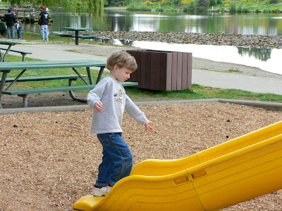 |
| Original |
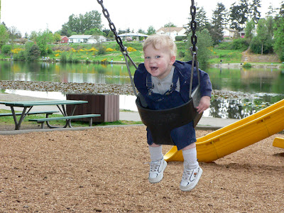 |
| Original |
Since they were different shapes the mouseover effect doesn't work very well. Oh, my baby boys are growing up so fast! I did use the mouseover effect for the other photos. I find it a much easier way to see what is different, especially when it is very little. Basically I ran Nice and Easy, adjusted the levels and the hue layers and added the pink and warming filter layer.
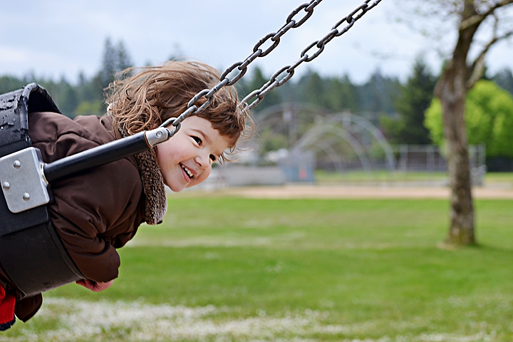 |
| I did crop on this one, add a Softlight duplicate at 17% for a little more pop, and after Ashley's tutorial went back and used that method to lighten her face and eyes just a tiny bit. |
Then, because I like to do things more than once after I learned them, and I didn't like how much wasted space there was in this picture but I didn't want a square crop, I played around with adding a circle around Sunflower--inverse selection, fill color white, 40% opacity. Now I just need some words about childhood and swings.
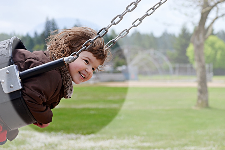 |
| Okay, maybe I just like to play in photoshop and this set didn't give me the need. |
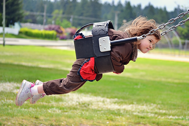 |
| Same edit as above except no crop and not dodging on her face. |
I waited to edit this photo until we learned how to dodge/burn with the non-destructive method. I haven't had a chance to read the link, but really the tutorial was quite enlightening. I do not understand why it works, but it was the perfect method for this photo. I did the nice and easy with my usual adjustments and then added the 50% gray layer and painted.
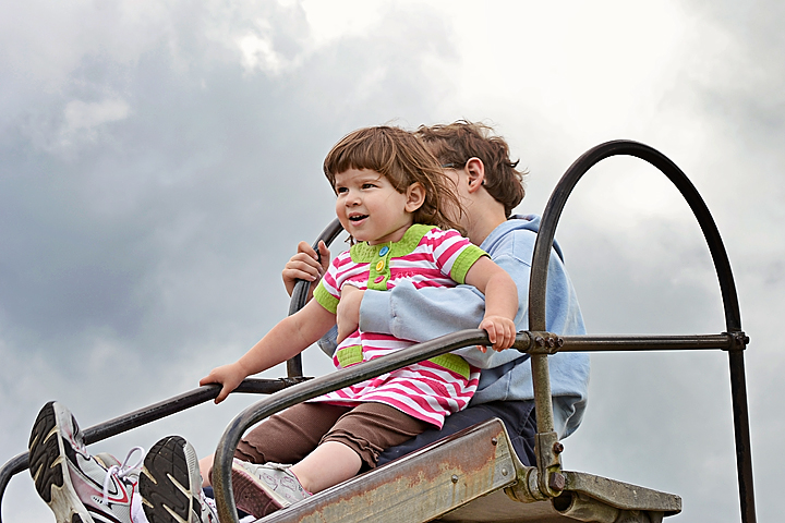 |
| I cropped a little closer and used the gray overlay layer to lighten her face a tiny bit and darken the sky. |
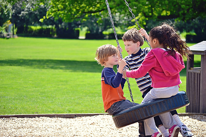 |
| All I did was a high pass filter and brighten the colors some. I love bright colors, so I like it. I love the tenderness on SnapDragon's face. |
That is all of my edits, but I'm going to share one more photo because my itsy-bitty baby boy...
...Huckleberry is graduating from 5th grade into Middle School today. I don't know when I'll have time to view everyone's edits because we will busy celebrating...and crying.
Be sure to check out all the other great slide/swing photos and edits over at
Ramblings and Photos.


8 comments:
These edits are really nice and clean. I like that!
Thanks for stopping by the other day. Very nice edits.
nice job, love your colors!
SO bittersweet, huh!?!
LOVE the swing edits. Truly amazing!
Love the edits! :D That last swing one turned out perfectly.
Awww... they grow up so fast!! My oldest turned 12 in January, and when I stop and think and realize that in less than a year he'll be **13** I freak out just a little bit. ;)
I love how your edits make the colours just pop! Good job!
Love all your edits! Isn't that dodge and burn effect very cool?!
Really great edits. I love them.
Post a Comment