I'm going to try this without quite as much commentary...oh, who am I kidding!
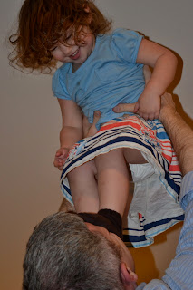 |
| Original |
First a clean edit--notice fixing the stain on her shirt. Some memories are okay to erase.
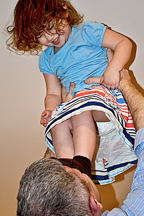 |
| Clean Edit + Nice and Easy |
This is what I will probably print. It represents the moment and is a sweet photo even if it isn't perfect. But I am not happy with how the low lighting gives it a strange glow around the bottom. So I tried a texture, but didn't like it. Then I thought Black and White. I changed the white balance so it was very bright and stark and ran CoffeeShop Chocolate BW. I added one layer of chocolate.
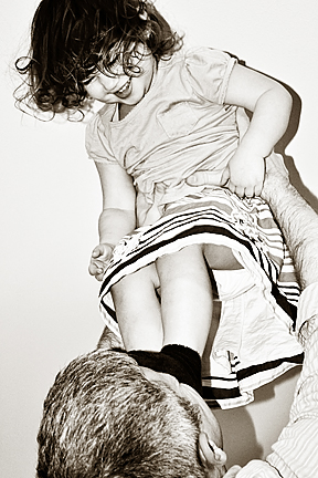 |
| Chocolate BW |
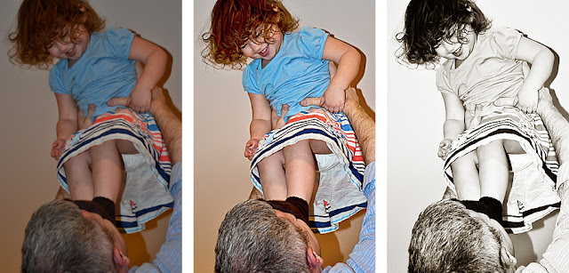 |
| Original Cleanish Edit Chocolate BW |
Then I worked on one of the pictures of SnapDragon in a tree.
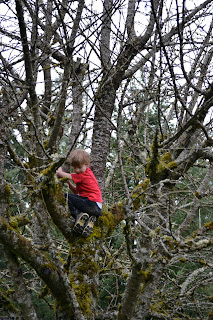 |
| Original |
I basically opened in ACR changed some numbers randomly and opened it in Photoshop. Then I ran Nice and Easy, tweaked the greens and reds back up (except on his face) and as a final added a green fill layer soft light at 40-something opacity. I also used the method in Week 7 or so to crop to the rule of thirds--well kind of--I think the cross is right on his shirt.
Then I tried another crop because it is so hard to see him.
His eyes and his feet are on the cross points. I'm hoping his arms are a nice leading line that leads your eyes to him and not away, but with so many lines in this photo...Thanks for the tutorial, Jill.
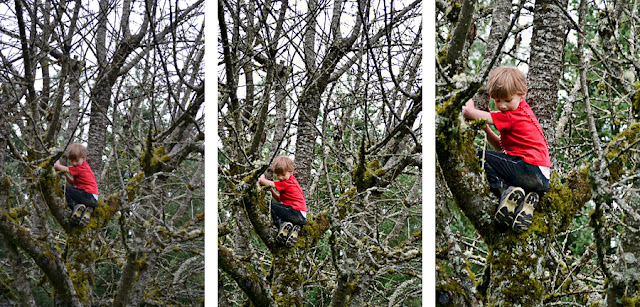 |
| Original Edit and Crop Edit and closer crop |
Maybe I could have gone a little lighter.
Then I worked on Sunflower's other up photo.
 |
| Original |
I don't have time to redo this, but I got it to what I wanted, then I experimented a little, then I tried to crop to rule of thirds, had to go back and somehow messed it up. I kept an extra soft light layer that I didn't want, but saved and closed as I realized it. I will redo it again--particularly because the cropping to rule thirds in Photoshop is very sub-optimal compared to cropping first in Iphoto--when I am choosing my box in Iphoto it draws the grid to the size of the crop. Very simple. So this is not cropped to the thirds, though it easily could be and her face got a little messed up with the extra layer. Sigh.
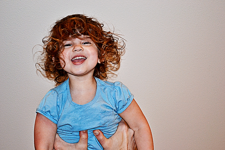 |
| Clean Edit + Nice and Easy + Soft Light not good choice layer |
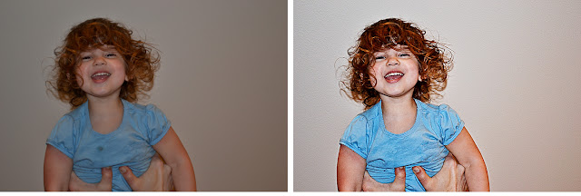 |
| Original Edit |
This morning I took this edit, put it back in Iphoto, cropped it and added texture-Celebration by Kim Klassen--erased it off her face completely.
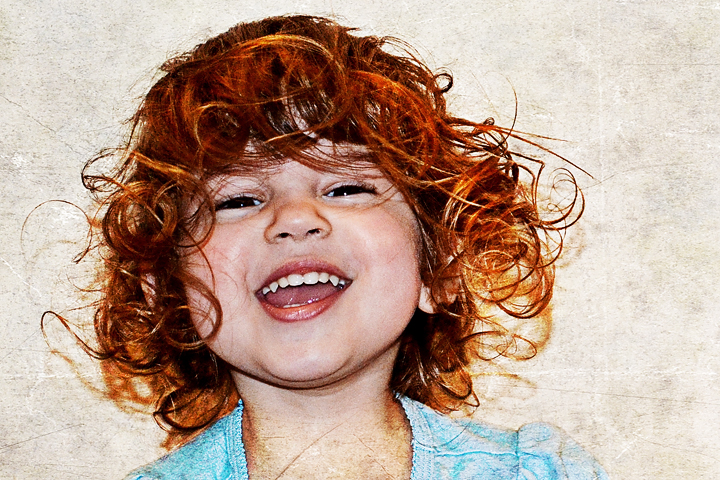 |
| Final Edit |
These UP photos of Sunflower goes to show you can do stuff to make the photo acceptable when it is too dark, but great SOOC are much easier to take from good to WOW.
Finally I am to my last UP shot--SnapDragon in the tree.
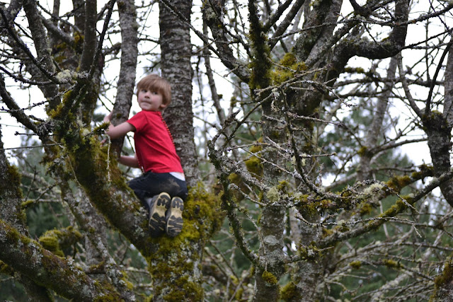 |
| Original |
The biggest problem with this photo is that his face is blurry. I noticed that in camera and took a second shot making sure to focus on his face. However, I also changed from horizontal to vertical--I was convinced I would like the vertical shots better--but I was wrong. So I swapped heads. Circled his little head in the other shot, cut it and pasted it over here. I erased around the edges to get rid of any tree, etc. and then blurred the edges together. Ran Nice and Easy and cropped in iPhoto. What do you think? Can you tell?
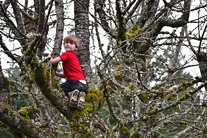 |
| Clean edit with new head |
I like this but I thought I would play some more since everyone told me to have fun. I tried some textures, but the picture already had enough texture. Finally I tried the CoffeeShop Magic Sunset just for fun. Makes it like a fairy tale to me.
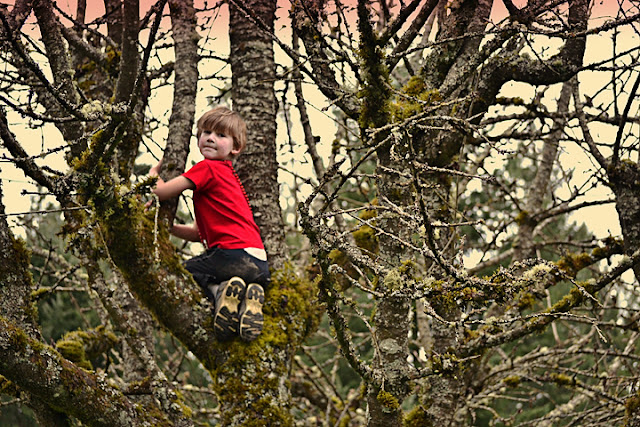 |
| Clean Edit with Magic Sunset (erased off of his face) and I colored his shirt some |
Have a great Thursday! Make sure to hop on over to Ashley's blog to see all the other UP edits; I am definitely planning to do so!




16 comments:
Nice edits, especially your clean edits.
Great edits! Your texture on Sunflower is so muc fun! :)
Love the chocolate edit!! My fave!!! All your edits are great!
These are all great edits but I am loving the last one of your little girl. That hair is AWESOME!
I love the chocolate edit of your daughter - she is so cute! :)
Oh how I love the close up photo!!! Perfect texture and edit!
B&w is awesome on the first photo. Last photo is amazing... even without the texture! :)
Great work here. You can see I'm revisiting your blog - wanted to spend a little more time looking at your photos.
Great edits...love how you cleaned her shirt!
I think these turned out really good! I can't tell that you changed the head on the one (I so need to learn how to do that). Great job! :)
I think all of your edits turned out really nicely! I really like the last one with the sunset added in - it really adds drama to an already great photo.
And I feel ya about getting rid of shirt stains - I don't need to remember my baby girl's (many) spills either. :)
Great edits. I love the final edit of your daughter.
I love your daughter's hair in the last one! :D But, I think I would have erased the texture off of her neck as well.
I really love the chocolate edit, and the last one with the sunset action. :D
beautiful clean edits. her curls and smile are wonderful!!!! she is really sweet!
Beautiful edits! I like how you played with texture on the closeup of your daughter's face. What a great smile & beautiful curls. :)
Ummm...Cedar...I thought this was suppose to be a post about how your photo taking wasn't that great, once upon a time....but the way you edited them they look fantastic to me.
I should send you the pic's I took today. :) Not too good.
:) Mer
Post a Comment