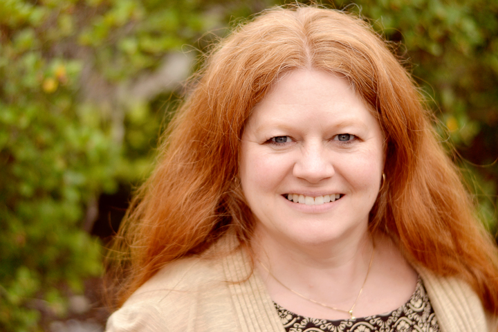
I have so many pictures from this week, I thought I would link to a few more Friday themes today.
I finally set up the tripod and remote while the boys were at school to take some pictures of Sunflower and I. Technically Sunflower was holding the remote most of the time, so she took these pictures. And she took a lot of them! She took them as fast as the camera would allow. Since my motivation for these photos was because I have very few pictures of myself with my mother (who died when I was 15) and I didn't want Sunflower to say the same, mission was definitely accomplished!
It was a fun way to spend time, and lest you think Sunflower sat uncharacteristically still...my camera takes pictures fairly quickly and...
I probably should have put make-up on, but I rarely do and it is about capturing true memories, right?
I am linking these to Deb Duty Photography's This or That Thursday.
Then I thought I would participate this week in Sky Watch Friday. I love all the glorious skies other's capture though I still struggle to duplicate the true beauty of what I see. This is almost what it looked like out on the Bay last weekend.
Then Favorite Photo Friday. Too difficult to choose and I've already shared a few photos of this rainbow, but in this one, if you look closely, you can see the start of a double rainbow up top. It really was stunning!
Lastly, this is my first time participating in Still Life Stand-Outs. I saw the amazing shots from last time, so I feel a little shy. But I got to play with my friend's new macro lens, and the narrow focus is oh so fun!
That is it for today. Be sure to check out some of those links to see some lovely eye candy. There are some really talented artists out there!
Thursday, September 29, 2011
Week 38 good to WOW edit Fall
So it is time for Thursday edits for Good to Wow (actually a little past time.) I did play with a few features of LightRoom, and I must say it is hard not to love Lightroom. It is taking a little bit of time to adjust to using adjustment brushes for everything instead of layer masks, and for some things I just have better understanding and control in PSE, but LR is cool! Especially since my Photoshop is Elements 6 so the ease of syncing photos in LR is a huge time saver.
So here are my puzzle edits. On all three I did the LR presets General Punch and Flat Tone, so I should/could have synced, but I also did a Lens Correction vertical but only on two of them. On the one with the streak of light I also raised my blacks a tad in order to cause the shadows to be even darker. Here one of the original so you can best see how changing the vertical under manual lens correction to -48 with constrain crop checked changed the perspective of the puzzle.
After making my edits I made a collage in LR using one of the print layouts in order to make sharing them more interesting--presentation. I hadn't cropped the darker one to be horizontal, but liked how it worked in the collage better. The top shadows were actually not that important to the image.
You can see my other originals here, including my last one. On my photo of my friend, I'm not sure it would be correct to say it was overexposed since the exposure on my friend was about right, but the background had certainly lost a lot of color. So aside from my normal two presets, dialing down the clarity, I used adjustment brushes to soften her skin a little and then all over the background to take down the exposure and brightness, take up the saturation, I tweaked that brush until I don't remember what exactly but I was satisfied. In the lower right corner I also added blue to the brush, but couldn't quite get what I wanted, still here are those results:
Then for fun I converted to BW using the LR preset "Green Filter" and added a frame per a tutorial I found while watching the tutorials Ashley linked--you basically bring all the sliders in Post-Crop Vignetting all the way to the left for a black frame.
It was interesting to try out different BW presets to see which one emphasized details and which ones totally washed this photo out, but I really need to explore how to make my own black and whites. I'm betting it would be a lot faster :)
So check out the other Fall edits over at Ashley's blog. I've already peeked at a few, and they are good!
Monday, September 26, 2011
Creation
I spent the weekend away from home with a friend and my camera. So much fun, and so many pictures! Here are just 3 from the trip.
I am choosing one of my Saturday morning sunrise shots for this week's sweet shot. It is really a sweet shot to me because I am almost never coherent enough at 6:15 to take photos and even if I was, I wouldn't have this view out my window! (I usually have trouble sleeping away from home and was up around 5 a.m. working in the peace and quiet on my Bible study homework, so no regrets at all.)
I was a little too tired to set up my tripod, but I propped the camera on the railing (really) and eliminated most of my hand shake. I used my kit 18-55 in order to get a wide enough shot to include the skyline and the moon.
Now I don't really need another Monday challenge, but I love the title of this new challenge--Capturing Beauty. It really is the goal of photography for me...to see beauty and capture it with a photo. Since I've started taking photos more seriously, I see beauty in more things, and I love it. I never want to lose that. I don't think it would be hard for anyone to see beauty in the scene my friend and I came across.
Lastly, this week's Texture Tuesday theme is LOVE. I love textures...does that count? Okay, I love taking pictures. I love a good bee capture. Bees love flowers.
I am choosing one of my Saturday morning sunrise shots for this week's sweet shot. It is really a sweet shot to me because I am almost never coherent enough at 6:15 to take photos and even if I was, I wouldn't have this view out my window! (I usually have trouble sleeping away from home and was up around 5 a.m. working in the peace and quiet on my Bible study homework, so no regrets at all.)
I was a little too tired to set up my tripod, but I propped the camera on the railing (really) and eliminated most of my hand shake. I used my kit 18-55 in order to get a wide enough shot to include the skyline and the moon.
Now I don't really need another Monday challenge, but I love the title of this new challenge--Capturing Beauty. It really is the goal of photography for me...to see beauty and capture it with a photo. Since I've started taking photos more seriously, I see beauty in more things, and I love it. I never want to lose that. I don't think it would be hard for anyone to see beauty in the scene my friend and I came across.
"God's Promised Gift"
Also taken with my kit lens |
Lastly, this week's Texture Tuesday theme is LOVE. I love textures...does that count? Okay, I love taking pictures. I love a good bee capture. Bees love flowers.
Week 38 good to WOW SOOC Fall
What better way is there to spend a fall weekend holed up in a condo, watching movies, and putting together a puzzle? Unless you do all of that AND take tons of pictures.
We also spent some time outdoors and taking pictures of the Bay and a few quaint tourist towns, but for the fall prompt, I thought the pictures of the puzzle would work best. I actually really struggled with interesting composition...it'll be fun to see my friend's pictures...but for shoot and edit, I have to submit my own.
Only about half done. Unfortunately, it was the easy half!
I took a lot of pictures playing with that streak of light. This is the photo I settled on as being the most interesting.
Puzzle done. This one will be a good one to experiment more with the distortion correction features in Lightroom. Even standing on the couch I was not tall enough to hold my camera over the puzzle directly parallel to it. Trust me I tried.
And what else brings fall to mind, but wind. Oh, so much wind!
I love this picture of my friend from the weekend. To give you an even clearer idea of the wind, I will post this next photo. It is already edited because I don't think it deserves to be posted more than once.
My hair had so many knots in it by the end of Sunday! Personally I like a black and white conversion better, but the hair isn't as noticeable then. (This was taken with my summer birthday presents--my tripod and remote shutter release. So great to have! Thank you, Captain Awesome, your present is in the mail...JK, it is sitting on the buffet, hopefully in the mail today or tomorrow. Happy Birthday!)
I hope you had a great weekend! Now I'm off to visit the other SOOC fall photos!
Saturday, September 24, 2011
Scavenger Hunt Sunday
It is Friday morning, and I really wanted to finish my Scavenger Hunt before I left for the weekend (girls away!) Sure a few have to dos slid by the wayside, but my hunt is done. Now whether my husband will link me up while I'm gone, or it'll be Sunday evening, I just have to wait and see.
Low Key:
I'll admit, I was really tempted to take pictures of my keys on the floor. As it is, I think this still might be too bright and cheerful to qualify as low-key photography, but my husband looked at it and said, "Well, for Sunflower that is as low-key as it gets." I also converted it to Black and White in the hopes of it fitting the prompt better.
Oh, my beautiful baby. You will be seeing a lot of her today.
Monochromatic/Analogous Color:
I was thinking her dress qualified as analogous color with its red, orange, and yellows, and then we went to a playground with red and yellow equipment. I thought it was quite serendipitous.
Circle:
I had other pictures of circles, but since I could not get myself to unify my processing, I unified my subject instead. So here is Sunflower and do you see the circles of bokeh?
Scarf:
I had other pictures that showed off the scarf better, but I just love her expression in this one.
Phone:
Not the best picture, but I just love her intensity. She was saying, "Julie, we'll be RIGHT over!"
Please do take the time to check out some other hunts. You can learn so much and see so many fun interpretations! I'll be visiting the hunts Sunday or Monday!
Thursday, September 22, 2011
Week 37 good to WOW Edit Adult Portrait
On Monday, via flickr, I shared one adult portrait I had taken of a friend from church. She loves pictures and was a fabulous subject, though the church parking lot probably wouldn't be a location of choice for a professional photographer. Luckily I am not a pro and a challenging location only forces you to learn more, right?
Anyway, here is the edit of the photo I shared on Monday (mouseover for original). It might be the favorite of the 32 photos I kept, but it might not be.
I did all of my edits for this one in LR3--+25 vibrance, -20 clarity, +25 contrast, flat tone curve, and custom white balance. I then applied these settings to all the photos. Then I used the adjustment brushes. I whitened her teeth and used the skin softening on her face with the brushes.
I thought about taking it further, but I thought I would experiment with other similar photos from the day to make things interesting. I did the same thing as above, but then for skin softening I took it into PSE.
I ran CoffeShop Blog's Perfect Portrait 3 for skin softening and since I was there also brightened the eyes a little. Then I ran Pure's action No Ordinary Slumber...I really like the tones it adds to a photo, subtle but warm.
I'm not really sure. The second one certainly looks a little more processed, and that is not really my goal, especially for a snapshot for a friend, but a portrait? There are opinions on the whole spectrum of options and I just don't know what my opinion is.
But rather than send my friend 10 headshots, I thought I would work on editing one of the full body shots I liked. I took very few because I just cannot get myself to back up!
The pasted settings, crop, +13 clarity (bringing it to -7), teeth whitening adjustment brush, and small vignette. Really I am content there, but I decided I wanted a black and white so I took it into PSE and got this:
I know it isn't black and white, but I found the black and white too busy with this background. I ended up just running two actions: Pure Pop and Pure No Ordinary Slumber; so easy. (Mouseover to compare the LR3 and PSE edits.)
But I still wanted a black and white. I know this is getting long, trust me, I know, but bear with me for one last photo and edit, if you will.
Just moved around a few sliders, +.20 exposure, +7 brightness, +2 saturation, +25 vibrance, flat tone preset, and custom white balance and I did use the skin softening adjustment brush. Then I tried to find a BW preset in LR3 that worked. I tried a lot of them, but it just wasn't happening for me. So I took it into PSE again in order to use my fall back, Pioneer Women's BW, but I didn't like that either. But I finally came up with a black and white photo.
Pure Baby Max, Pure Sunset, and Pure No Ordinary Slumber. I guess I couldn't quite give up completely on color.
So there you have it...my edits for this week's Shoot and Edit. Check out Ashley's blog for more portraits!
Monday, September 19, 2011
It's Tuesday {Almost}
Time for my favorite Tuesday links. I cannot think of a way to link these but I want to share them. There is no theme and it feels so random, so lets just call them all sweet.
And really what is more sweet than my baby girl with her gardening gloves unless it is...
...her picking "flowers." I used a vintage preset in LR3 for fun.
I love this sweet boy, too. (And their brother, but no photos of Huckleberry today.)
Now here is a photo I took at the beach a few weeks ago. I really liked it though I couldn't tell you why. It might be because it fits the analogous color scheme The Kat Eye View of the World taught about this week in Exploring with the Camera.
Blue and green being next to each other on the color wheel means this photo has analogous color, right? So much to learn, so little time!
Then two flowers for Texture Tuesday. Actually, two flowers with texture, but only one uses Kim Klassen's texture.
I had waited a little too long to take pictures of the flowers I got at the Farmer's Market. Thank goodness for PSE and textures. Sorry you didn't get to see the pretty orange flowers we bought!
This is one of the photos that didn't get chosen for Sunday Scavenger Hunt's liquid, but now that I've edited it I might actually like it better than the chosen one.
Be sure to check out the links to see more sweet shots, explorations with a camera, and textures. There are lots of incredible art to see!
And really what is more sweet than my baby girl with her gardening gloves unless it is...
...her picking "flowers." I used a vintage preset in LR3 for fun.
I love this sweet boy, too. (And their brother, but no photos of Huckleberry today.)
Now here is a photo I took at the beach a few weeks ago. I really liked it though I couldn't tell you why. It might be because it fits the analogous color scheme The Kat Eye View of the World taught about this week in Exploring with the Camera.
Blue and green being next to each other on the color wheel means this photo has analogous color, right? So much to learn, so little time!
Then two flowers for Texture Tuesday. Actually, two flowers with texture, but only one uses Kim Klassen's texture.
Kim Klassen Aurora 100% Soft Light; Turned 180 degrees (I don't want to tell you, but you might notice the upside down words.) |
Pure Love Letter Texture with Scrolls (from Pure Photoshop) 100% Soft Light masked off of flower. |
Be sure to check out the links to see more sweet shots, explorations with a camera, and textures. There are lots of incredible art to see!
Subscribe to:
Posts (Atom)